I designed key user scenarios for further testing and iteration
I designed key user scenarios for further testing and iteration
I designed key user scenarios for further testing and iteration
In collaboration with the founders, art director, and brand designer, I designed the MVP version of the product, oversaw its development, and conducted the initial user testing.
In collaboration with the founders, art director, and brand designer, I designed the MVP version of the product, oversaw its development, and conducted the initial user testing.
In collaboration with the founders, art director, and brand designer, I designed the MVP version of the product, oversaw its development, and conducted the initial user testing.

⬥YUNG — an AI-driven psychotherapy service for teams
YUNG creates customized digital programs to help employees deal with issues such as burnout, depression, anxiety, PTSD and everyday stress, bridging the gap between in-person counseling and the digital realm.
Website — https://yung.app/
Product type — Web App
Geography — USA
Business model — B2B
Audience — startup employees
The founders, long-time practitioners of psychotherapy, aimed to craft a product grounded purely in scientific methodology.
The team and my role
In this project, I collaborated with an Art Director and a Brand Designer. Anton (the Art Director) provided me with a strategic design vision, while Dima (the Brand Designer) handled the visual style.
My role was to translate these concepts into the architecture, scenarios, and interface logic.
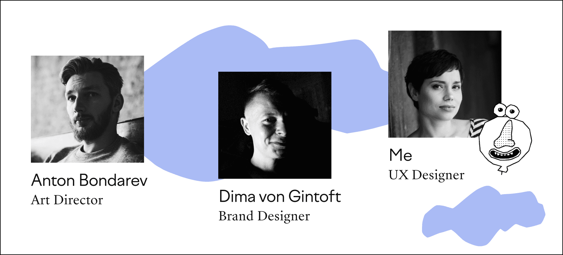
The design team
The process
My extensive experience working with early-stage startups has taught me a specific sequence of steps, where speed and optimization are paramount.
Naturally, I always tailor the process to the situation, but I never skip the core stages essential for a full-fledged product journey.
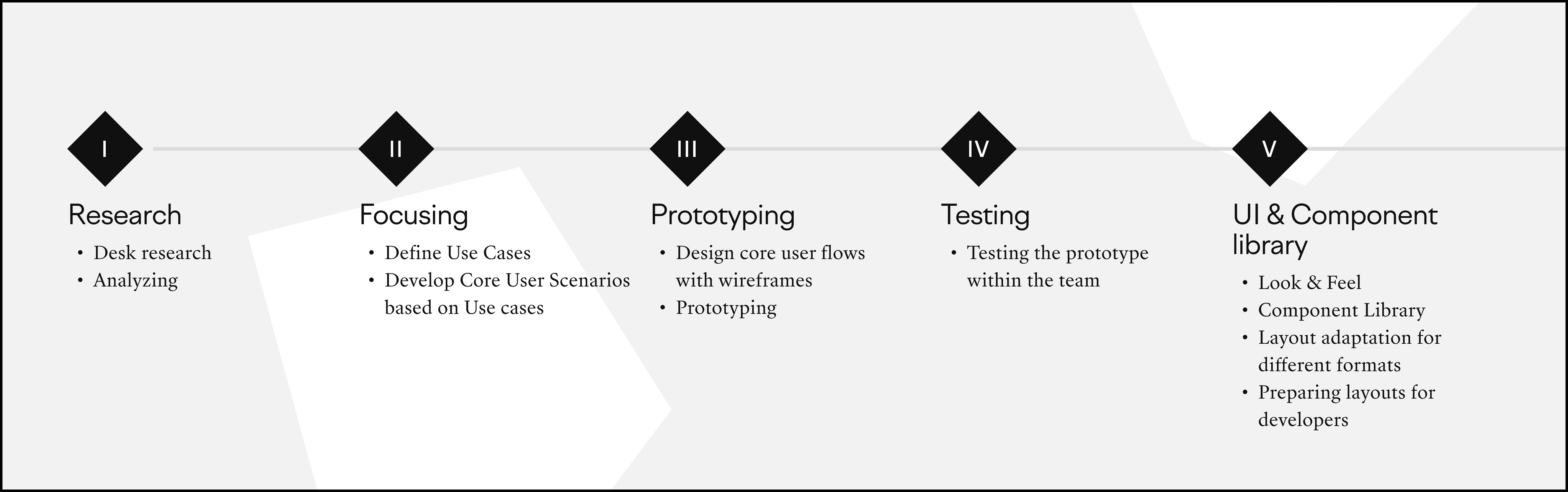
Research
Understanding the founders' vision:
The founders sought a holistic mental health solution via a tailored chatbot. My role: ensure a seamless user transition between bot and application, and embed the product naturally into daily routines.
Market & competitor insights:
Founders initiated the market research; I delved deeper, extracting key solutions. Our standout: an integrated chatbot with a continuous feedback mechanism shaping precise therapy.
User insights & challenges:
Our target: startup employees battling potential burnout. Given tight timelines, I focused on desk research, accessing comprehensive analyses of mental health apps and user feedback.
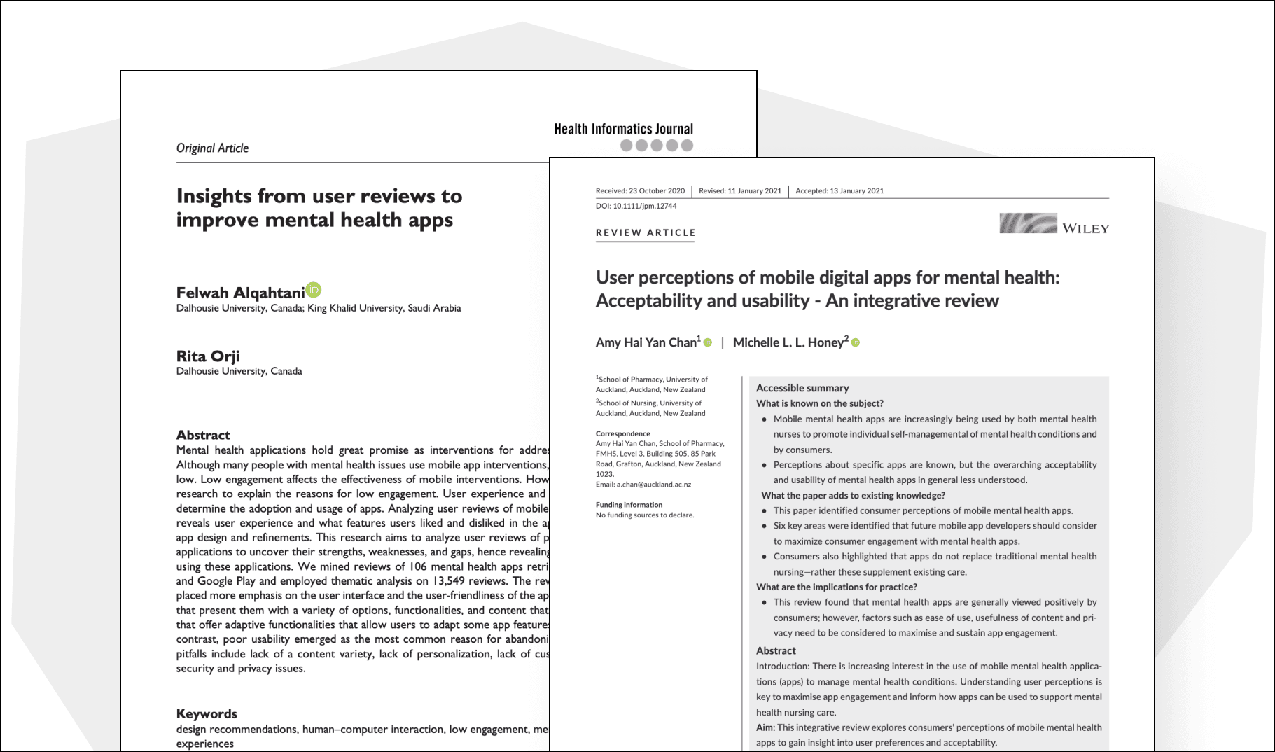
An example of scientific papers that include a comprehensive analysis of user reviews and present formulated insights
Focusing
The main functionality was defined by the founders. My task was to polish the use-cases and design key user scenarios based on them.
Example of a use-case:
"Initial login using a personalised link"
Actor: New user
Prerequisites: The user has received a personalised link to access the app.
Main flow:
The user clicks on the personalized link and enters the app.
The user is greeted with introductory information about Yung and its benefits.
The app presents the available courses and the user selects the desired course.
After selecting the course, the user is prompted to read the detailed course description.
After reading, the user is prompted to take a survey to determine their current mental state.
Once the survey is completed, the app instantly displays the results of the survey.
Based on the results of the survey, Yung creates an individualized therapy program for the user.
The user is then introduced to the chatbot feature and prompted to activate it to receive reminders and additional resources throughout the course.
Wireframes and Prototyping
After establishing the information architecture, I proceed to the stage of designing key scenarios and creating a clickable prototype.
We are primarily creating not just an image, but a tool through which users will solve specific tasks. And how effectively the tool works can only be understood in practice.
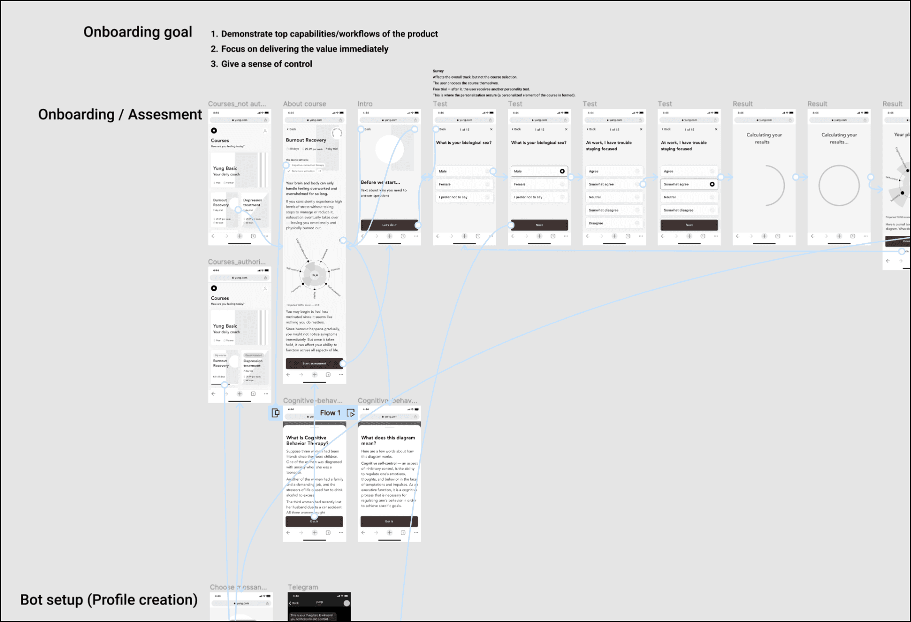
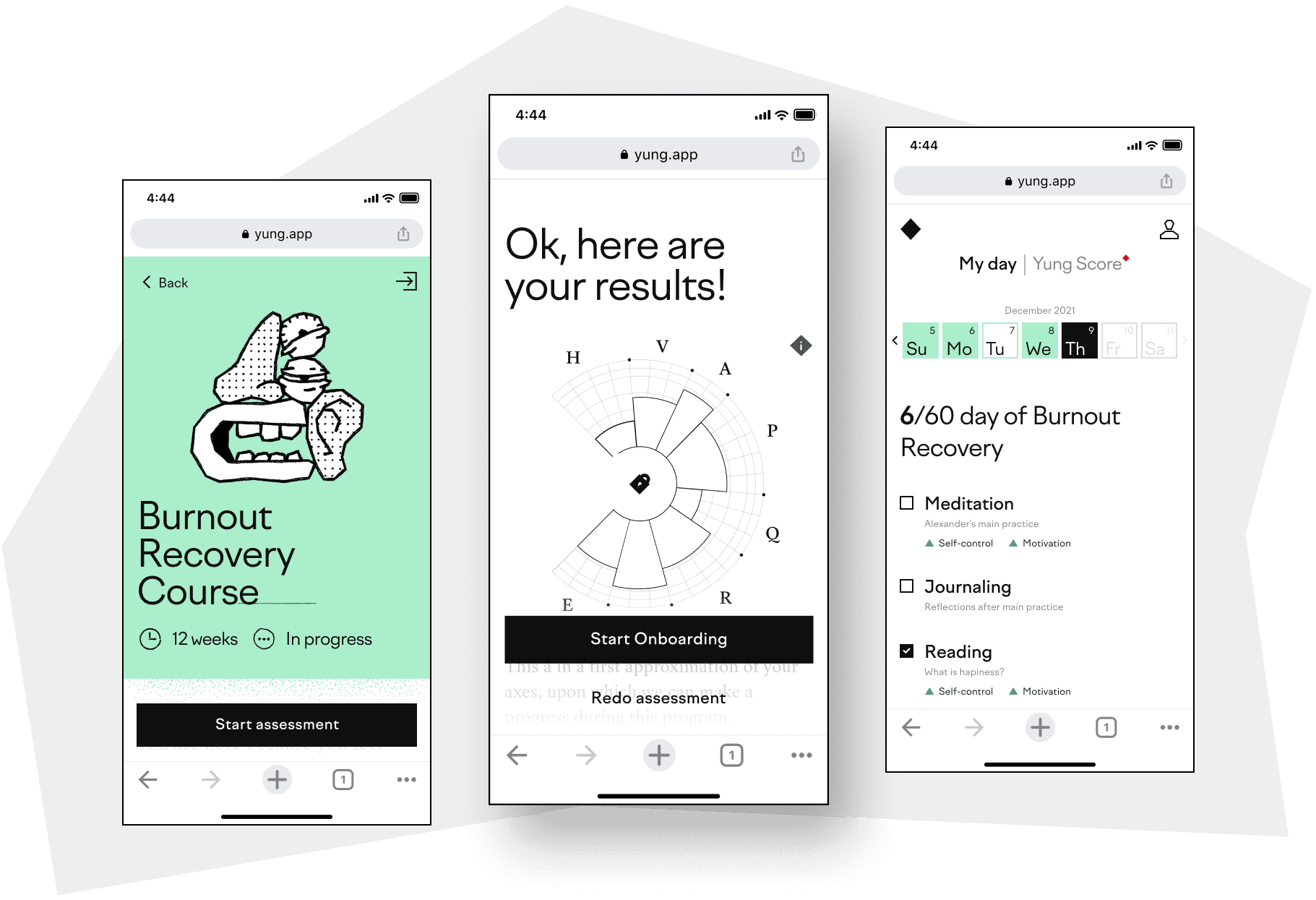
Prototype for the activation flow (first use)
Link to the first version of the clickable prototype in Figma
An additional benefit of such practice always results in a clearer understanding of the design by the client, which minimises subsequent revisions.
Testing
Usually, with the first prototype in hand, I begin testing it on family members and friends. Even if they aren't potential users, this approach helps identify obvious gaps in key aspects. This is especially relevant when you're the only one responsible for the comfort of potential users.
I ask founders to do the same. I can say that founders always actively participate in this process. For them, it's the first opportunity to see and "try out" the implementation of their idea, which until then existed only in their minds. And to identify areas that need further refinement.
After our initial testing, we streamlined the user experience by removing unnecessary steps.
We optimised the questionnaire to provide initial results after 10 questions, rather than 30, saving the subsequent questions for later.
We also rethought the dashboard's layout, placing the calendar as the central element on the main screen.
Look & Feel
Dima managed to craft a truly unique visual style that emphasized the product's distinctiveness. The identity is designed in a neo-brutalism style. Its sharp-edged and bold black-and-white aesthetics are balanced with gentle color fills.
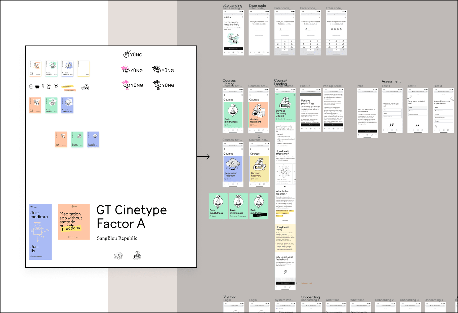
Adaptation of screens to the approved visual language.
Component Library
Even if there isn't time to create a full-fledged design system, I always create a component library. Which will later serve as the foundation for the design system.
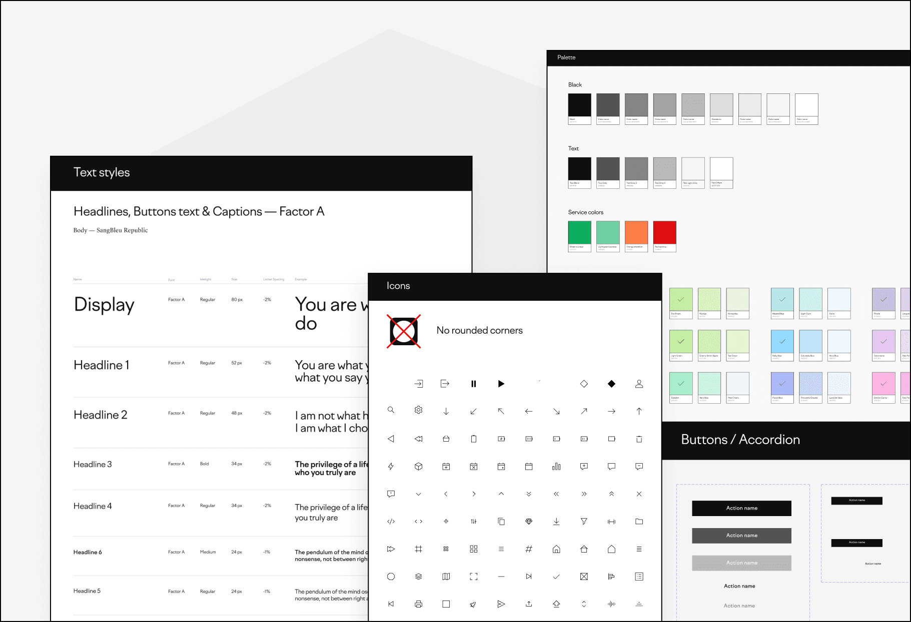
Much has been said about the benefits of a systematic approach, but I'll add that creating a component library in the early stages of the design process:
Allows the designer to better understand the logic and limitations of the developer.
Prevents impulsive decisions by the designer that could lead to overly complex visual elements.
Helps to assess the appropriateness of the visual concept and, if needed, adapt the design of certain components for easier reuse. For instance, you realize that the button design is hard to adapt for smaller devices or the chosen font doesn't work well with certain languages.
Examples of insights from desk research and their implementation in the product
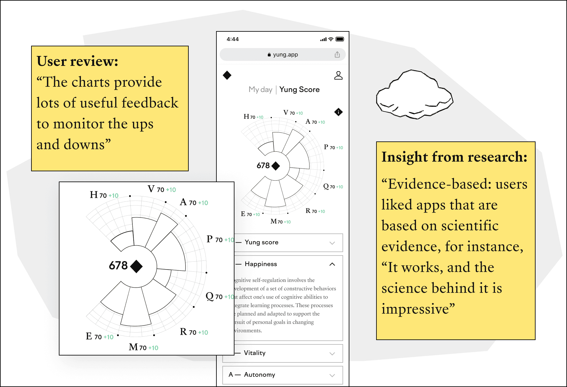
User review: “The charts provide lots of useful feedback to monitor the ups and downs”.
Implementation: The application analyzes the results of regular surveys, reflecting the dynamics on Yung's signature feature — the graphical 'jellyfish'.
Insight from research: “Evidence-based: users liked apps that are based on scientific evidence, for instance, “It works, and the science behind it is impressive”.
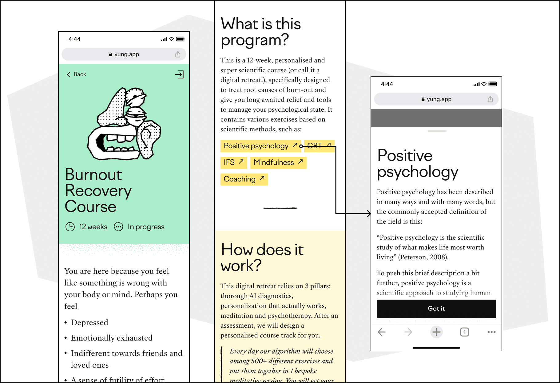
Implementation: Throughout the user journey, the application subtly explains the scientific foundation behind YUNG. Users always have the opportunity to learn more about how the therapy works, including the significance of all the terms used.
Key Learnings:
Understanding client vision: Fully grasping the founder's vision is paramount. It's not just about building a product, but about materializing a holistic solution that meets a real-world need.
Rapid prototyping: Early-stage startups often operate under tight timelines. Being able to quickly translate a vision into a tangible, interactive prototype allows for better stakeholder communication and faster iterations.
Value of desk research: While primary research is invaluable, there are times when desk research can provide comprehensive insights, especially when targeting specific demographics like startup employees.
Adaptable user experience: Testing, feedback, and subsequent adaptations are crucial. It's essential to be agile, recognizing areas of friction and promptly optimizing them for a smoother user experience.
The power of visual identity: A distinctive visual identity, like the neo-brutalism style crafted by Dima, can set a product apart. It's not just about aesthetics but aligning the visual language with the brand's ethos and mission.
Client's Feedback:

"Maria did an awesome job for us at Yung.app, going from initial sketch to full-scale project mockups in 2 months. Proper expertise on the subject, communication & work."
Alexandr Anastasin, co-founder @Yung.app
⬥YUNG — an AI-driven psychotherapy service for teams
YUNG creates customized digital programs to help employees deal with issues such as burnout, depression, anxiety, PTSD and everyday stress, bridging the gap between in-person counseling and the digital realm.
Website — https://yung.app/
Product type — Web App
Geography — USA
Business model — B2B
Audience — startup employees
The founders, long-time practitioners of psychotherapy, aimed to craft a product grounded purely in scientific methodology.
The team and my role
In this project, I collaborated with an Art Director and a Brand Designer. Anton (the Art Director) provided me with a strategic design vision, while Dima (the Brand Designer) handled the visual style.
My role was to translate these concepts into the architecture, scenarios, and interface logic.
The design team
The process
My extensive experience working with early-stage startups has taught me a specific sequence of steps, where speed and optimization are paramount.
Naturally, I always tailor the process to the situation, but I never skip the core stages essential for a full-fledged product journey.
Research
Understanding the founders' vision:
The founders sought a holistic mental health solution via a tailored chatbot. My role: ensure a seamless user transition between bot and application, and embed the product naturally into daily routines.
Market & competitor insights:
Founders initiated the market research; I delved deeper, extracting key solutions. Our standout: an integrated chatbot with a continuous feedback mechanism shaping precise therapy.
User insights & challenges:
Our target: startup employees battling potential burnout. Given tight timelines, I focused on desk research, accessing comprehensive analyses of mental health apps and user feedback.
An example of scientific papers that include a comprehensive analysis of user reviews and present formulated insights
Focusing
The main functionality was defined by the founders. My task was to polish the use-cases and design key user scenarios based on them.
Example of a use-case:
"Initial login using a personalised link"
Actor: New user
Prerequisites: The user has received a personalised link to access the app.
Main flow:
The user clicks on the personalized link and enters the app.
The user is greeted with introductory information about Yung and its benefits.
The app presents the available courses and the user selects the desired course.
After selecting the course, the user is prompted to read the detailed course description.
After reading, the user is prompted to take a survey to determine their current mental state.
Once the survey is completed, the app instantly displays the results of the survey.
Based on the results of the survey, Yung creates an individualized therapy program for the user.
The user is then introduced to the chatbot feature and prompted to activate it to receive reminders and additional resources throughout the course.
Wireframes and Prototyping
After establishing the information architecture, I proceed to the stage of designing key scenarios and creating a clickable prototype.
We are primarily creating not just an image, but a tool through which users will solve specific tasks. And how effectively the tool works can only be understood in practice.
Prototype for the activation flow (first use)
Link to the first version of the clickable prototype in Figma
An additional benefit of such practice always results in a clearer understanding of the design by the client, which minimises subsequent revisions.
Testing
Usually, with the first prototype in hand, I begin testing it on family members and friends. Even if they aren't potential users, this approach helps identify obvious gaps in key aspects. This is especially relevant when you're the only one responsible for the comfort of potential users.
I ask founders to do the same. I can say that founders always actively participate in this process. For them, it's the first opportunity to see and "try out" the implementation of their idea, which until then existed only in their minds. And to identify areas that need further refinement.
After our initial testing, we streamlined the user experience by removing unnecessary steps.
We optimised the questionnaire to provide initial results after 10 questions, rather than 30, saving the subsequent questions for later.
We also rethought the dashboard's layout, placing the calendar as the central element on the main screen.
Look & Feel
Dima managed to craft a truly unique visual style that emphasized the product's distinctiveness. The identity is designed in a neo-brutalism style. Its sharp-edged and bold black-and-white aesthetics are balanced with gentle color fills.
Adaptation of screens to the approved visual language.
Component Library
Even if there isn't time to create a full-fledged design system, I always create a component library. Which will later serve as the foundation for the design system.
Much has been said about the benefits of a systematic approach, but I'll add that creating a component library in the early stages of the design process:
Allows the designer to better understand the logic and limitations of the developer.
Prevents impulsive decisions by the designer that could lead to overly complex visual elements.
Helps to assess the appropriateness of the visual concept and, if needed, adapt the design of certain components for easier reuse. For instance, you realize that the button design is hard to adapt for smaller devices or the chosen font doesn't work well with certain languages.
Examples of insights from desk research and their implementation in the product
User review: “The charts provide lots of useful feedback to monitor the ups and downs”.
Implementation: The application analyzes the results of regular surveys, reflecting the dynamics on Yung's signature feature — the graphical 'jellyfish'.
Insight from research: “Evidence-based: users liked apps that are based on scientific evidence, for instance, “It works, and the science behind it is impressive”.
Implementation: Throughout the user journey, the application subtly explains the scientific foundation behind YUNG. Users always have the opportunity to learn more about how the therapy works, including the significance of all the terms used.
Key Learnings:
Understanding client vision: Fully grasping the founder's vision is paramount. It's not just about building a product, but about materializing a holistic solution that meets a real-world need.
Rapid prototyping: Early-stage startups often operate under tight timelines. Being able to quickly translate a vision into a tangible, interactive prototype allows for better stakeholder communication and faster iterations.
Value of desk research: While primary research is invaluable, there are times when desk research can provide comprehensive insights, especially when targeting specific demographics like startup employees.
Adaptable user experience: Testing, feedback, and subsequent adaptations are crucial. It's essential to be agile, recognizing areas of friction and promptly optimizing them for a smoother user experience.
The power of visual identity: A distinctive visual identity, like the neo-brutalism style crafted by Dima, can set a product apart. It's not just about aesthetics but aligning the visual language with the brand's ethos and mission.
Client's Feedback:
"Maria did an awesome job for us at Yung.app, going from initial sketch to full-scale project mockups in 2 months. Proper expertise on the subject, communication & work."
Alexandr Anastasin, co-founder @Yung.app